Research 
Background
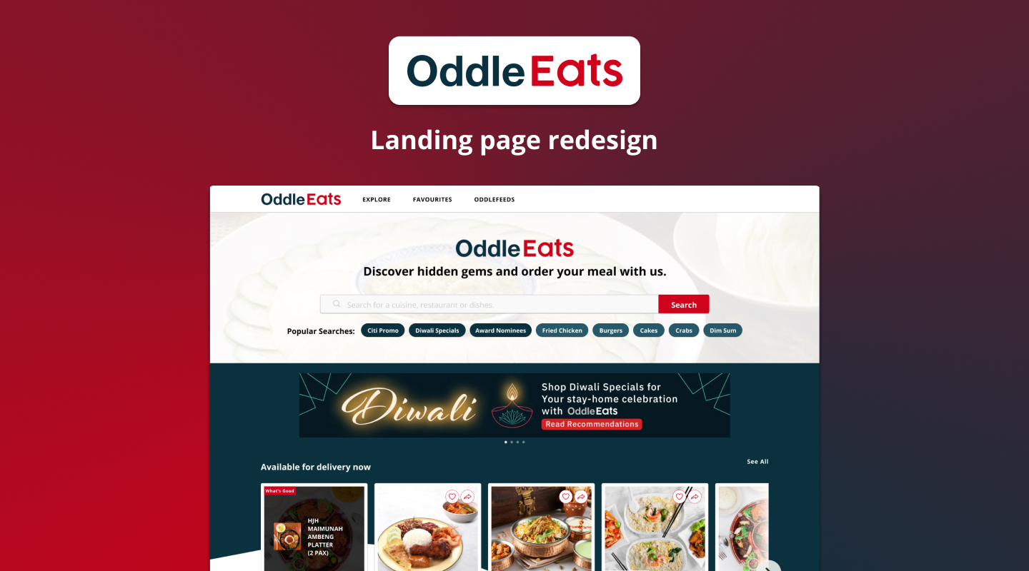
OddleEats is a food delivery platform owned by Oddle. Currently, they have more than 5,000 restaurants on their platform and their aim is to help restaurants grow and adapt to the digital era. By providing restaurants with user data, such as order histories, past visits and interactions, they will be able to identify touchpoints and better user engagement.
Problem
Data has shown a high drop-off rate during the customer journey, with the landing page showing the highest bounce off. The aim of this case study is to review of the website and propose a recommendation in the form of concepts or UI solutions on how to improve it.
Approach
In this case study, I conducted some interviews to better understand the underlying reasons behind the high bounce off rates on the landing page and used this as a form of verification for some of the initial problems I have identified with the site. In the redesign, I decided to go with a framework where for every redesign or new feature I proposed, I will first identify the problem and justify them with a solution, rationale, hypothesis and measurement of success.
Synthesise 
Personal Findings
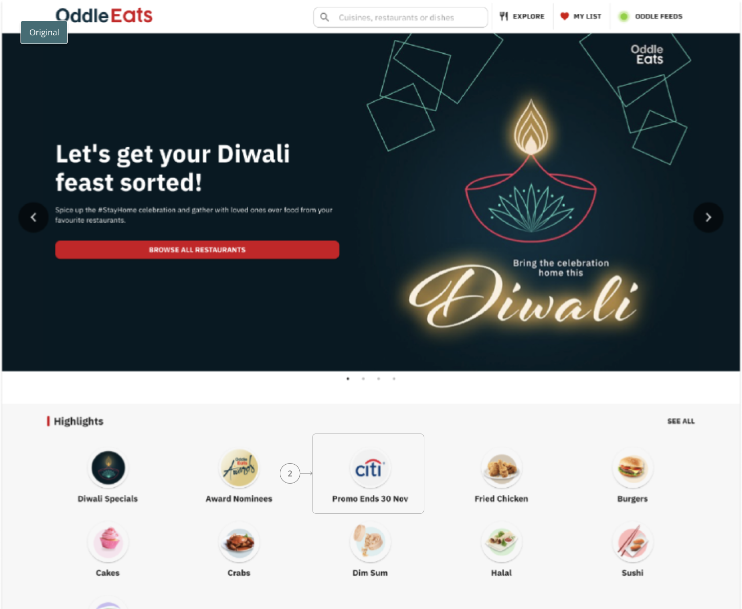
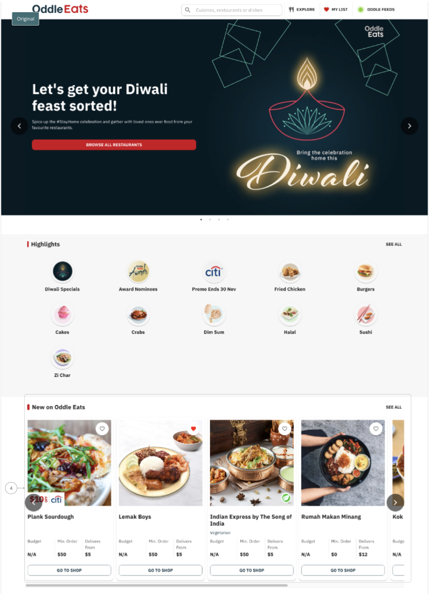
1. Questioned effectiveness of the billboard because the horizontal scrolls are not ideal for desktop.
2, The variety of food in highlights is very specific and unrelatable. Promotions could be more elevated and perhaps “food you might like” would be better in capturing my attention.
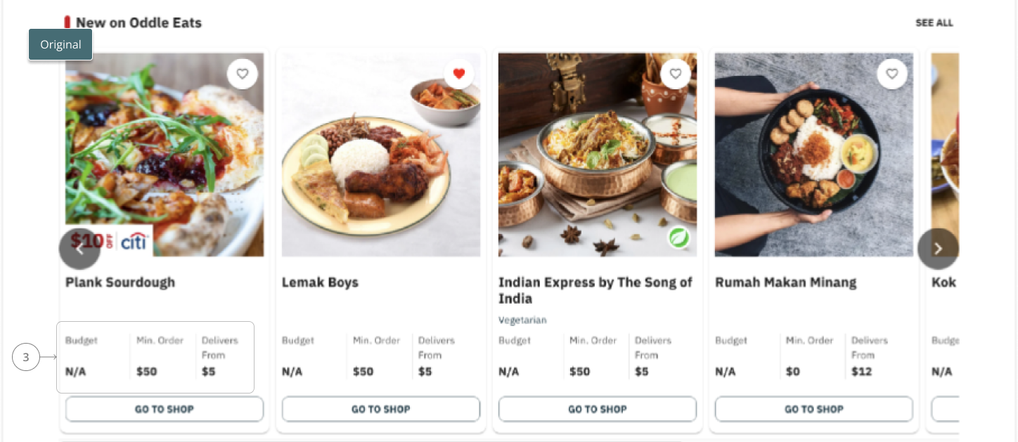
3. The restaurants in the “New” queue is very foreign to me and positioning it as the first belt affects my first impression of the site.
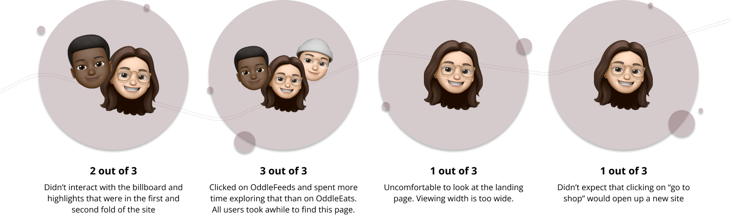
User Observations and Interviews
I conducted some interviews with 3 users where I had them share their screens with me as they explored OddleEats landing page. Through the interviews, I was able to observe their behaviour on the page and I also recorded some of the findings I had during the interview with them.

Redesign
Link to prototype: OddleEats Redesign Link
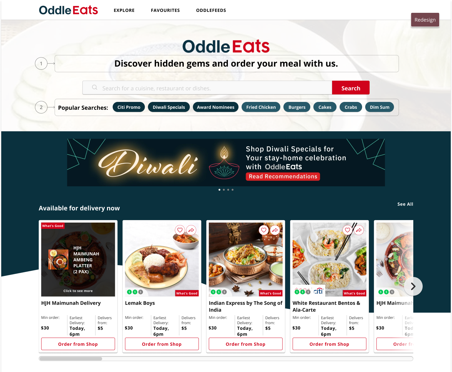
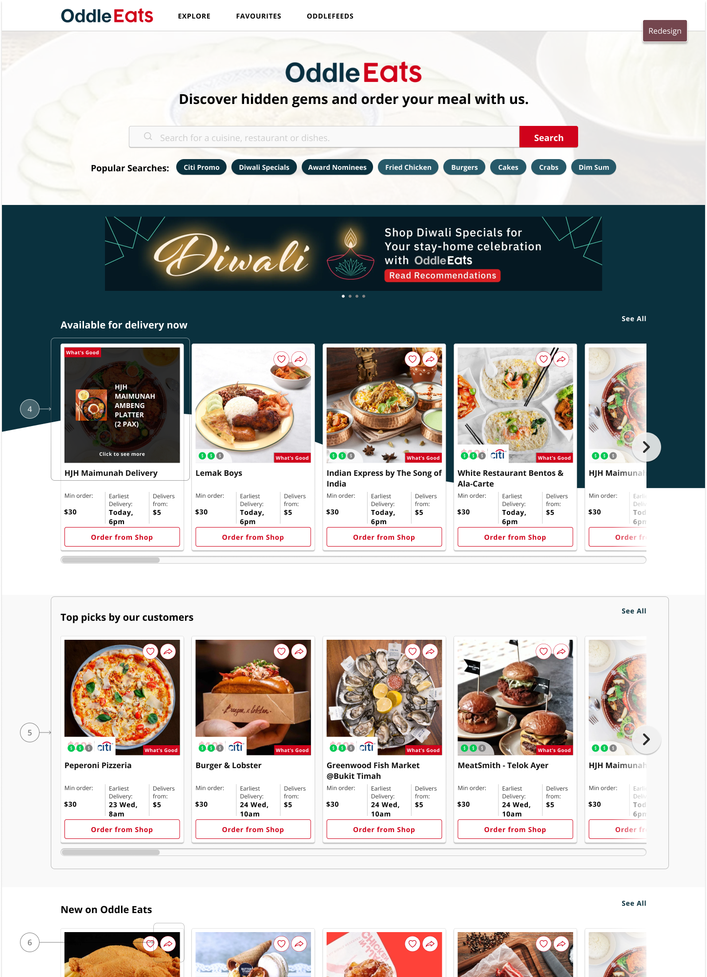
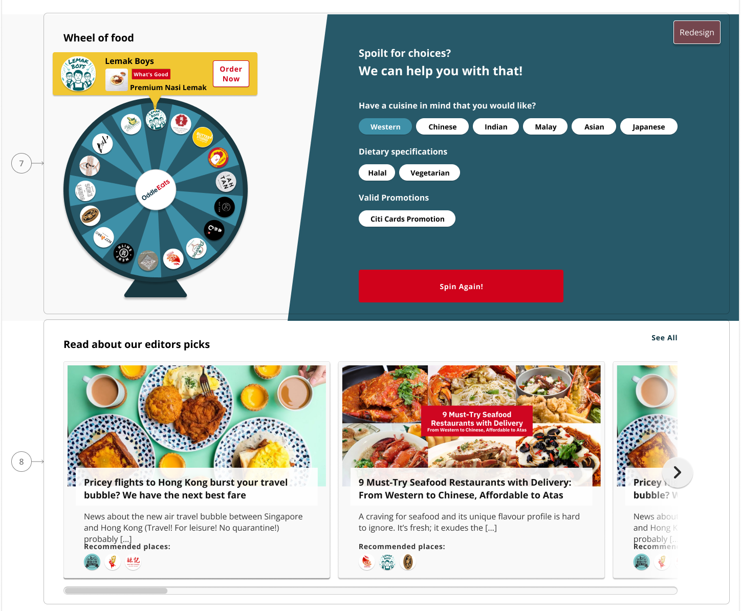
1. Put value proposition of the site at the top together with the latest updates and promotions.
💡 Users takes awhile to understand the purpose of the site, by clearly displaying value proposition, it will help new users identify purpose of site quicker and reduce drop-offs.
📈 Instant drop-off from sites should be lesser
2. Put promotions in a queue of its’ own or a solo banner that makes it more visible instead of having it as a small icon in the highlights
💡 Since there are many other similar sites with similar use cases, it is important for customers to see promotions upfront as this sets the site apart from others. Clearer display of promotions will increase number of transactions for promotional listings.
📈 Successful transactions made within promotional listing should increase
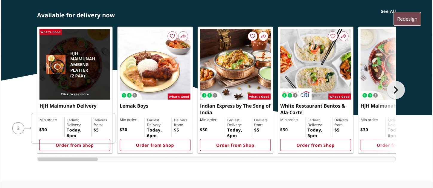
3. Put earliest delivery time upfront
💡 After following through the entire flow, users were unable to checkout as restaurant was unable to deliver during specified timing which leads to frustration. Displaying earliest delivery time upfront will help generate more successful transactions.
📈 Successful transactions made should increase
4. Show restaurant specialities in the cards
💡 Famous dishes would be easier for customers to relate to and connect with when they are looking for food. Having it on the card would make it more convenient for them to decide between restaurants without having to click in
📈 % of clicks on CTA button from the cards should increase
5. Put “popular” instead of “new” restaurants on top to increase familiarity
💡 New restaurants are like a wild card in attracting users attention as they might be completely unfamiliar and difficult to resonate with. First thing that users sees sets the expectations for the site. Having popular restaurants will give better impression that the site is up to date with current trends.
📈 Successful transactions made should increase
6. Add share buttons on the images together with the favourites
💡 This would encourage users to interact with the page and also increase reach, visibility and pageviews as it is more convenient and visible for them to do so.
📈 % of pageviews for landing page should increase and % of click through rate for share button is substantial relative to total site interactions.
7. A randomiser to engage users
💡 Listings can only suggest food that users can eat to a certain extent as ultimately it is still up to the users to make the first click to look at what the restaurant has to offer. Giving them a random specific restaurant will eliminate the infinite choices.
📈 Instant drop-off from sites should be lesser
8. Put some articles from OddleFeeds articles in the landing page
💡Currently, OddleFeeds are rather hidden and based on the interviews I have conducted, users spent more time reading these articles than browsing the listings. This will help to increase user engagements with the landing page.
📈 Use of heatmap to monitor hotspots that users are on
Other Projects
Designing for Work-Domain ExpertsProject type
Evaluating the Taxi-Hire experienceProject type

AsiaOne Elections 2020Project type

AsiaOne LogofolioProject type
OddleEats RedesignMini Project

Connecting loved ones with KI+School Project
Redesigning an itinerary experiencePersonal Case Study